Image Credit: Cherlynn Low / Engadget
Hiking with the Watch Ultra
To get a better sense of the Watch Ultra as a companion for outdoor adventurers, I went on a moderate hike in New Jersey’s South Mountain reservation without a map. I was accompanied by our video producer Brian, who had a 3.2-mile trail downloaded to his phone on AllTrails, but that was for backup purposes only. I was hiking blind.
I activated the Backtrack feature on the Watch Ultra and created a Waypoint at the parking lot just before we embarked on the trail. I also started a hiking workout to help monitor the time and distance we’d covered.
Even with a map as a failsafe, we got lost a few times. On one of those occasions, we only realized we were going the wrong way when I noticed that the watch was showing us going in a straight line. Brian heard me say that, recalled that we should have made a pretty sharp left turn a little while ago and pulled up his map to confirm. Would we have gotten hopelessly lost had I not been checking the Watch Ultra? Probably not. We would have noticed we weren’t where we were supposed to be at some point. But the device saved us some time and kept us on the right track.
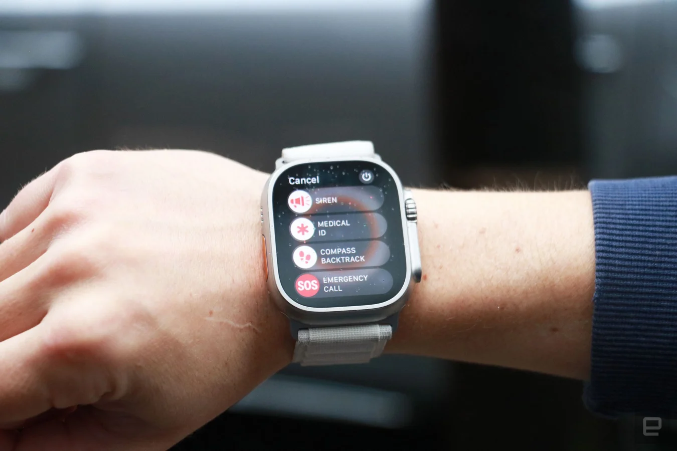
Midway through the hike, we tested the new Siren feature that uses the Ultra’s two onboard speakers that Apple said make it 40 percent louder than the Series 8. The company said one of the speakers was specifically designed to also function as an emergency siren, playing a pattern of beeps and alarms to alert your companions or nearby emergency responders to your location.

Cherlynn Low / Engadget
I asked Brian to walk away before I went and hid behind a tree. Then I played the siren and did my best to stay out of sight. Brian found me within five minutes. Granted, I didn’t go very far, and there weren’t huge trees with thick trunks. Brian said that the siren initially sounded like a bird, and indeed, the first few sounds the watch plays are a series of shrill chirps. But they give way to wailing patterns and the morse code beeps for SOS, so people eventually won’t mistake them for anything natural.
The siren seemed plenty loud to me, but from Brian’s perspective, it got somewhat lost in the sound of leaves rustling and a nearby gurgling stream. Obviously, the closer Brian got to me, the clearer he heard the siren. But don’t count on the Watch Ultra to draw rescuers to your exact location from a mile away.
During our hike, we came across a cute little creek and wanted to mark it in case we decided to come back. Since I had set the Watch Ultra’s action button to set a waypoint, I pressed it once to drop a pin, and the system prompted me to label the spot. I didn’t have to start from scratch — the watch had already filled in a suggested name, and I could use the onscreen keyboard to edit it. With the Ultra’s roomy screen, by the way, typing is surprisingly less cumbersome than on smaller wearables.
Thanks to its increased brightness of up to 2,000 nits, the Watch Ultra’s screen is easy to see in direct sunlight. A lot of this also has to do with Apple’s interface, which mostly uses bold, colorful fonts against a dark background.

Cherlynn Low / Engadget
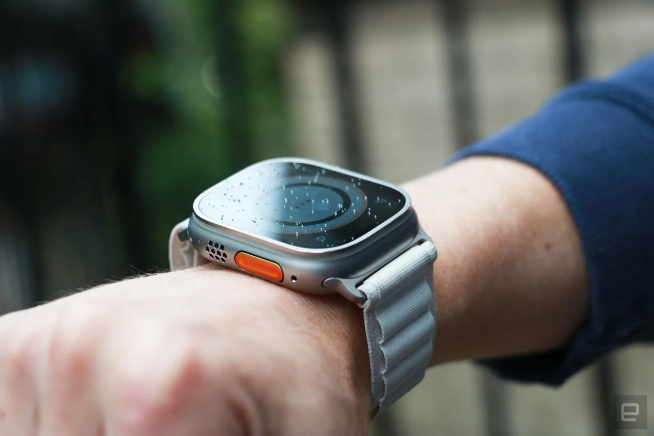
Though I found it convenient to quickly set a waypoint with the Action button, I often accidentally pressed it when trying to push the digital crown. My thumb would naturally rest along the side of the case while my index finger reached for the dial, which frequently caused both buttons to be pushed at once. This meant that I kept getting the screen for creating a waypoint instead of going to the home page, for instance.
It was more annoying after I had set the action button to start a workout. The number of two-second hikes that are now in my activity history are testament to how easy it is to hit the action button. Over time, I learned to place my thumb where the strap connects to the case. But if you’re really struggling you can always set the action button to do nothing (though that would defeat its entire purpose altogether).
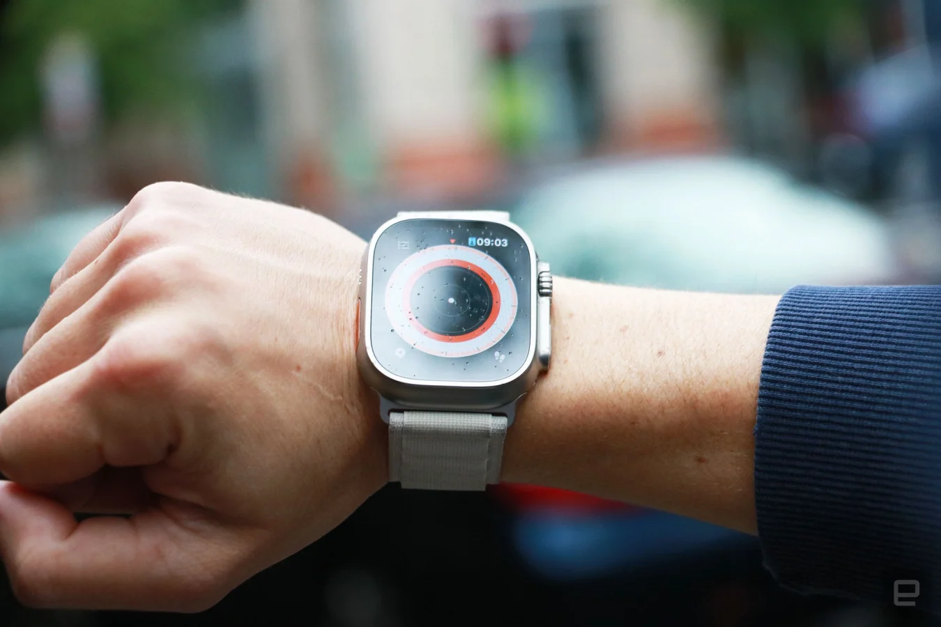
When we were nearing the end of our trail, Brian and I decided to use the waypoint we had created for the parking lot to find the exit. It was slightly confusing to find the page that would show us the directions — we had to rotate the crown while in the Compass app to zoom in and out of different views. The Orienteering view, which appears after you twist the dial all the way in, shows the route you’ve been taking and your waypoints. Tapping one of these flags brings up a list of your saved sites and you can choose one to navigate to. The Watch Ultra will show how far away you are from the spot, as well as in what general direction (left or right) you should head.

Cherlynn Low / Engadget
I followed the onscreen instructions towards the parking area, which the Watch said was just 400 feet away. I’ll confess: At this point I could already tell where the car was, so it was hilarious when, hundreds of feet away from the vehicle, the Watch buzzed to tell me I had arrived.
The GPS wasn’t super accurate, but I wasn’t expecting it to bring me within inches of the car. I also took this opportunity to check on the Backtrack feature to see if the Watch Ultra could reliably bring me back through the trail we had completed.
Once again, I found the interface confusing. Tapping the footsteps symbol on the bottom right of the Compass app brought up options to retrace or delete the steps I had saved. When I tapped retrace steps, it took awhile for me to realize which direction to turn and how to follow the orange line on the screen. I finally caught on when I started walking back in the direction I had come from, and saw some progress on the watch. In general, I find the Waypoint feature more useful than Backtrack, as it creates a more direct path to where I want to go, as opposed to making me retrace my entire journey.
We didn’t trek into the night, but had it gotten dark, we could have also used the Night mode version of the Wayfinder watch face. This changes the interface so all onscreen elements are in red while the background is black, which makes it easier for you to see in the dark.
"some" - Google News
October 05, 2022 at 08:02PM
https://ift.tt/uf9vXFh
Apple Watch Ultra review: A big smartwatch with some little quirks - Engadget
"some" - Google News
https://ift.tt/D9g7COy
Shoes Man Tutorial
Pos News Update
Meme Update
Korean Entertainment News
Japan News Update
Bagikan Berita Ini


0 Response to "Apple Watch Ultra review: A big smartwatch with some little quirks - Engadget"
Post a Comment